Understand an Overwatch area
Monitoring of an Area of Interest (AoI) is necessary to understand the hidden activity happening around critical infrastructure, ports, areas or economic zones where you have a particular interest in keeping control. Overwatch will help uncover unreported vessel activity within that area. Over time, Overwatch can give you a better understanding of heat spots for this hidden activity, whether it is unreported fishing, transshipments or spoofing.
The data presented to the user is all detected instances of vessels observed in a satellite image correlated with all AIS signals for the area. Three data types are made available for the users' inspection by fusing the data sources. Insights are classified into various categories:
- Verified AIS positions (detections of vessels in a satellite image with a corresponding AIS message).
- Dark vessels (detection of vessels in a satellite image without a corresponding AIS message).
- Uncorrelated AIS messages (AIS positions without corresponding vessel detection in a satellite image).
- Static objects (such as wind turbines and platforms).
The conceptual representation of the classes and how they relate are seen in the figure below.
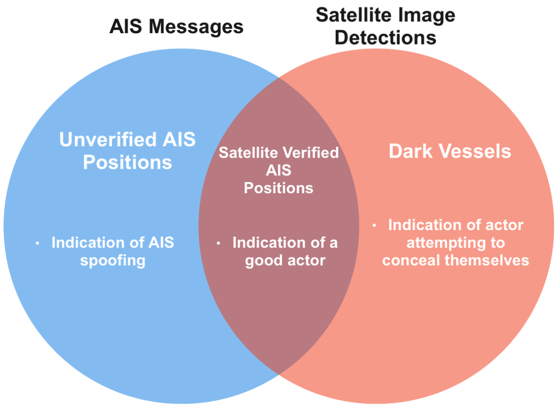
Figure 1: Conceptual drawing of insight classes used in Overwatch and Pathfinder.
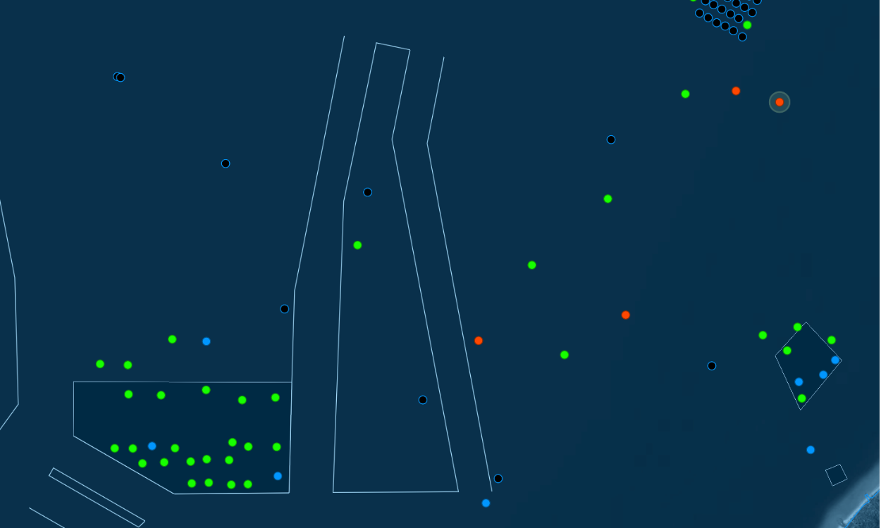
Figure 2: Demonstration view of an Overwatch report for an area. Insights are seen as circles on the map whose colour indicates the categories described above. Green circles are verified AIS positions, meaning they are correlated with detections in satellite imagery. Red circles are dark vessels, meaning detections of vessels in satellite imagery that have not been matched with a corresponding AIS message. Blue circles are uncorrelated AIS messages, meaning AIS messages that have no corresponding satellite image detection. Static objects (wind turbines, platforms, etc.) are seen as black circles with blue edges.
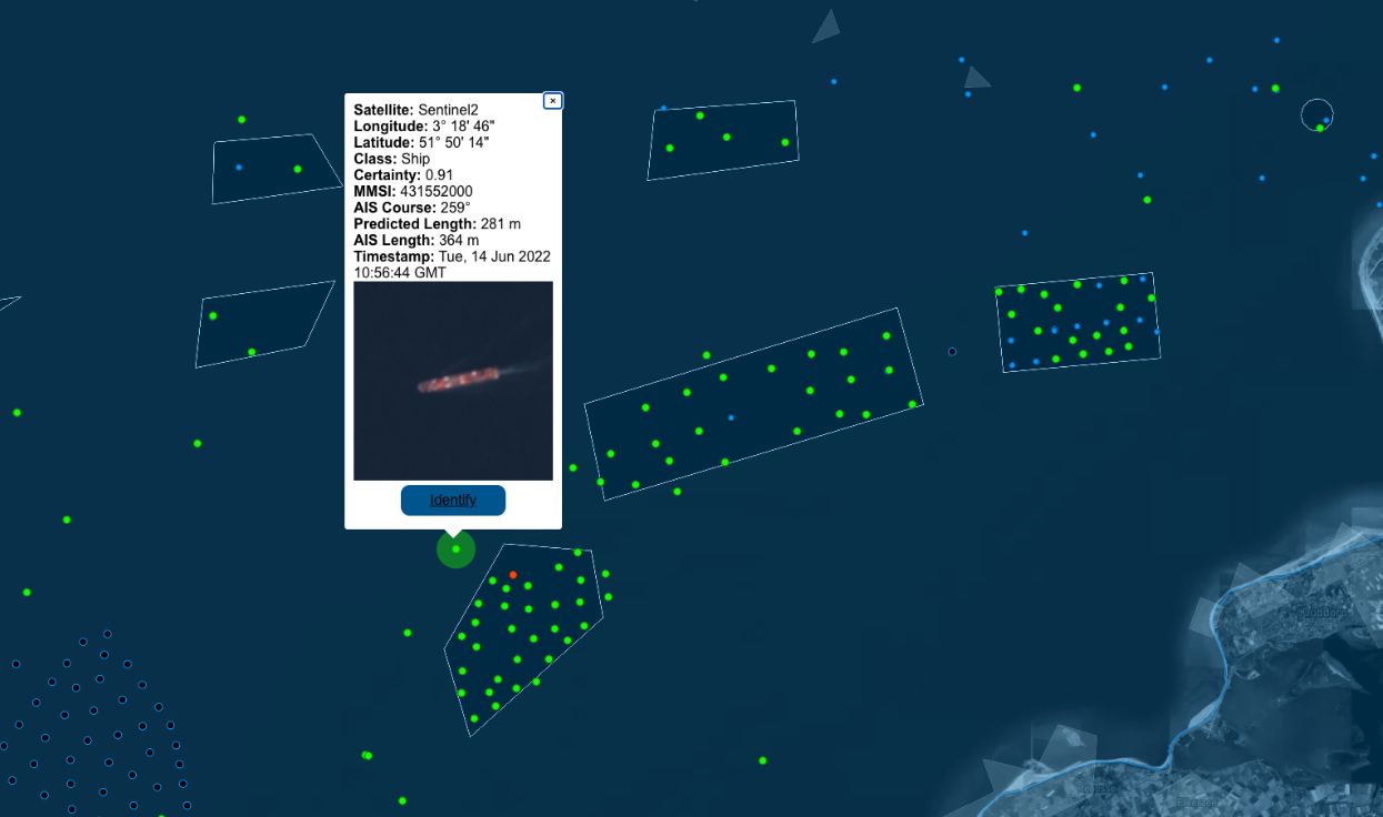
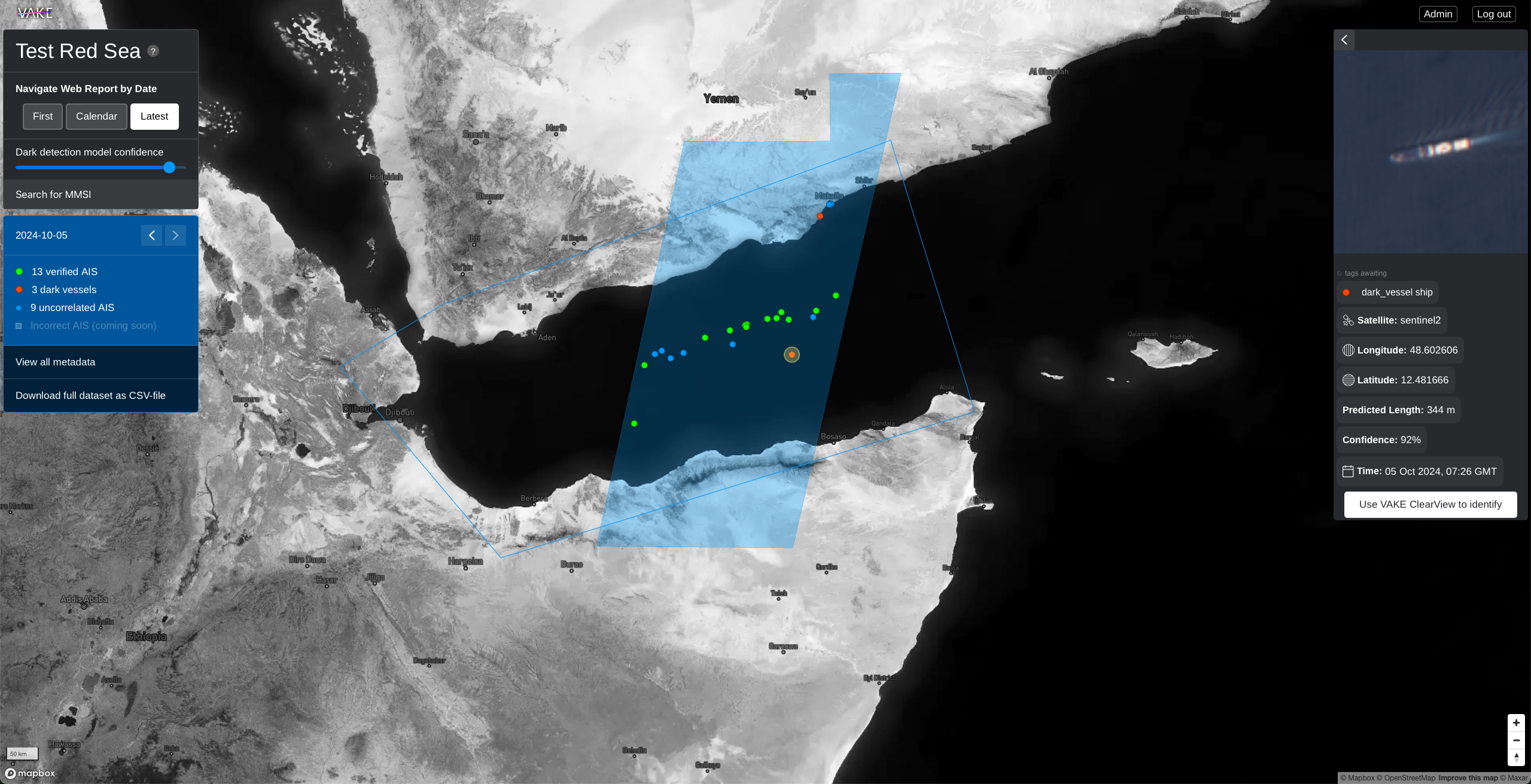
Figure 3: Verified AIS position with satellite imagery detection in an Overwatch report.
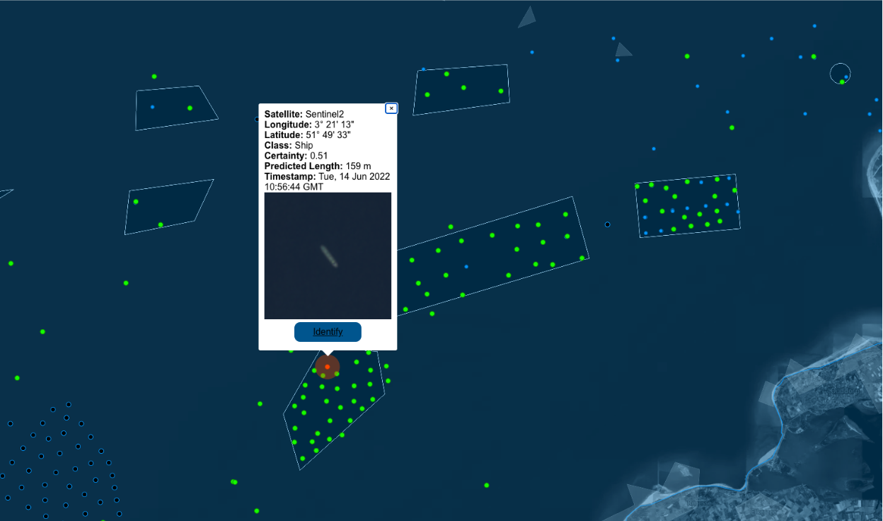
Figure 4: Dark vessel with no corresponding AIS message
Static menu (left menu)
The static menu gives context to the report.
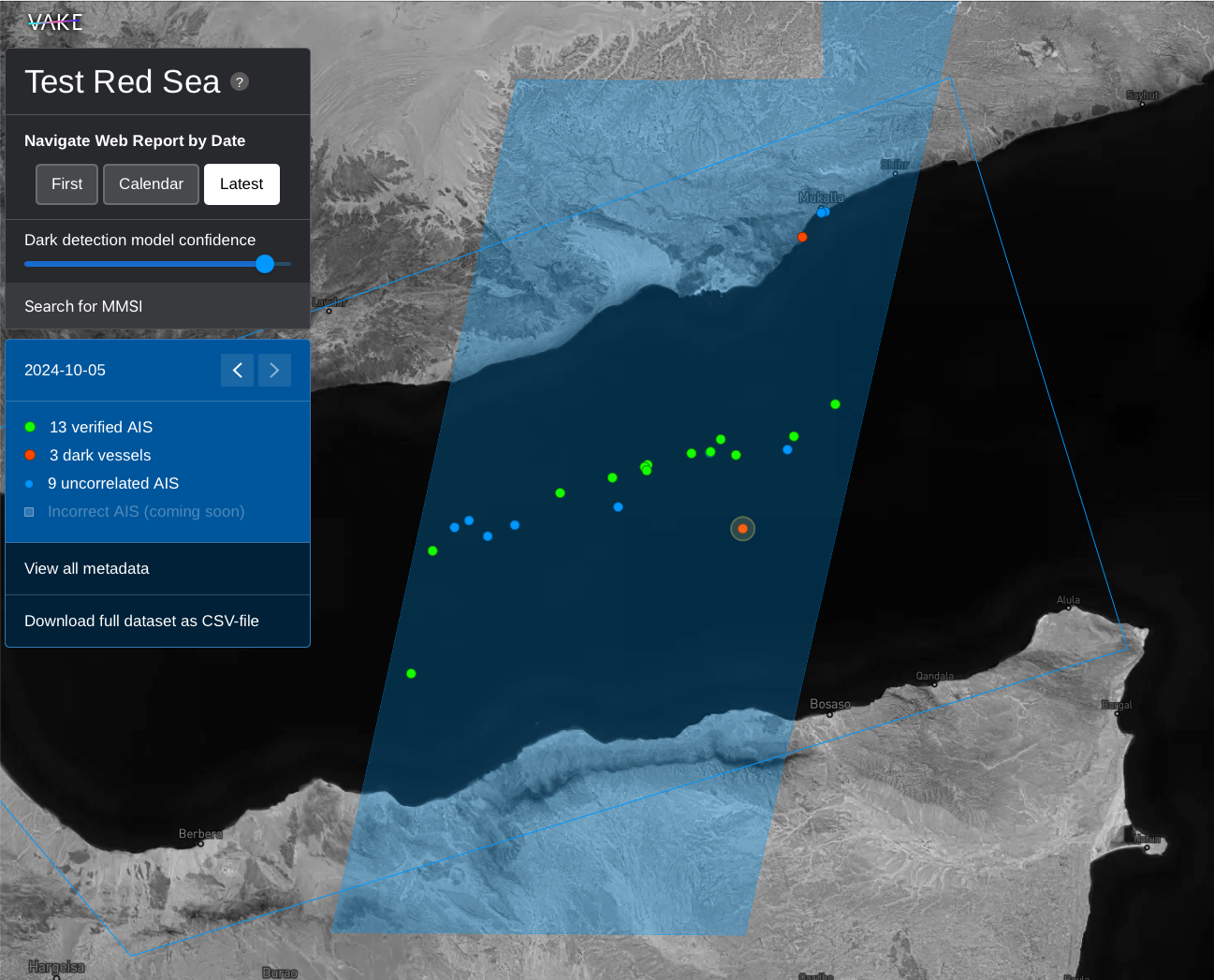
In the top you are able to navigate the report by date. As the report displays one day at the time, this selector is essential for what is displayed in the map.
Below the date picker, you are able to adjust the model confidence. In some areas, at some times, there are a lot of white caps (waves) that the model might interpret as small vessels. In such instances, the model confidence slider lets you demand a higher confidence before reporting dark vessels.
In the static menu you are also displayed legends that explains the separate elements in the map:
- Green dots are all detections that have been matched with an AIS transceiver.
- Red dots are all detections that could not be matched to a known vessel.
- Blue Dots are all AIS receivers that could not be matched to a detection.
By clicking “View all metadata” and zooming out, you can see the status for the image passing. A green passing means that images from this passing is processed and ready to be viewed. Yello means the image from the passing are currently being processed. Red indicates that the passing is currently not processed.
Dynamic menu (right menu)
The dynamic menu is located at the right hand side, and displays all events for the area of interest, for the day you have selected.
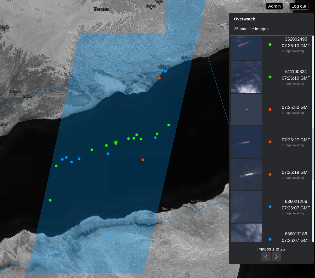
Hovering the images in the dynamic menu makes the event in interest to be marked in the map. This makes it easy to connect the dynamic menu to the map.
By clicking either on an event in the menu, or by clicking on an event marked in the map, the dynamic menu changes to event-view, and gives you more information about this specific event, and relevant action(s) to this event.
Map
The map is the core visual navigation element in the report.
Navigating the map works in the same way as you are familiar with from other big maps-products
- Move around the map: Left-click and drag to navigate in the map.
- Zoom in or out of the map: Press the Plus (+) or Minus (-) keys in the bottom right corner. Tip: Hold command (Mac) / Ctrl (Windows) and use the scrollwheel on your mouse to zoom to the exact level you prefer.
- Tilt (3D mode): Right-click and drag to adjust tilt of the map.
Visualised events:
- Green dots are all detections that have been matched with an AIS transceiver.
- Red dots are all detections that could not be matched to a known vessel.
- Blue dots are all AIS receivers that could not be matched to a detection.
- Black dots are infrastructure registered in our database.